Case Study · College Board · 2019–2025
PowerFAIDS: Making an Enterprise Financial Aid Platform Usable
I led UX and human-centered design for PowerFAIDS, a complex platform that educational institutions use to manage student financial aid. My work turned institutional rules and data-heavy workflows into clear, accessible experiences for financial aid administrators.
Up to 90%
higher task success on redesigned critical workflows
Up to 70%
less onboarding time through simpler navigation, labels, and content hierarchy
50%
faster setup of saved searches after the Selection Sets redesign
My Role
- Role: Lead UX Designer / Product Designer
- Team: UX, product management, financial aid SMEs, and React development teams
- Tools: Figma, Protopie, Apricot Design System
The Challenge
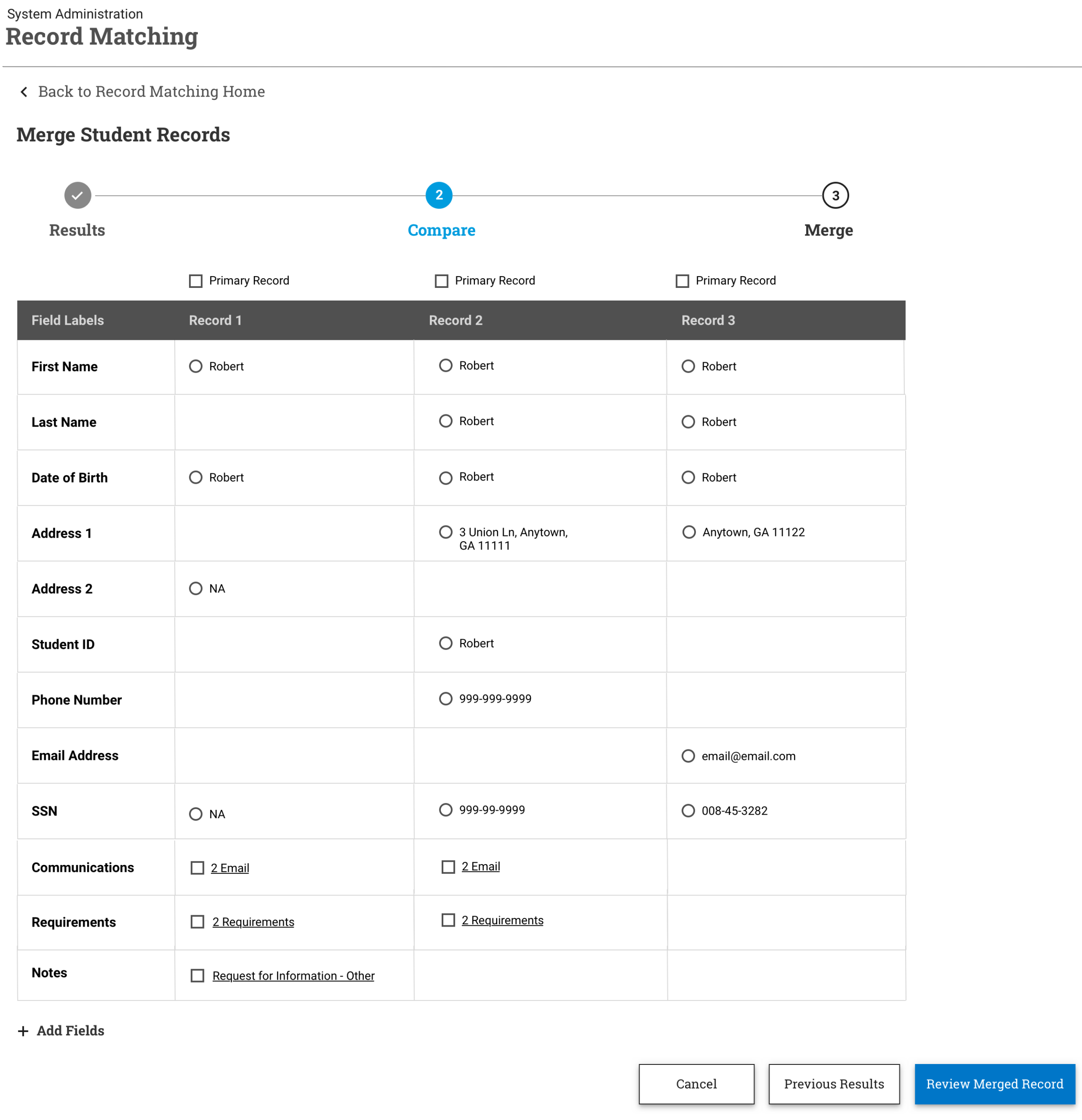
Financial aid administrators handle complex, regulated work: grouping students, checking eligibility, and acting on missing documents. The platform reflected the institution’s rules more than its users’ tasks. Terminology was technical, workflows were hard to learn, and users had little visibility into saved searches and the conditions behind them.
Approach
- Research: stakeholder interviews, usability studies, heuristic evaluations, and journey mapping with financial aid administrators, including 10+ users across institution types for Selection Sets.
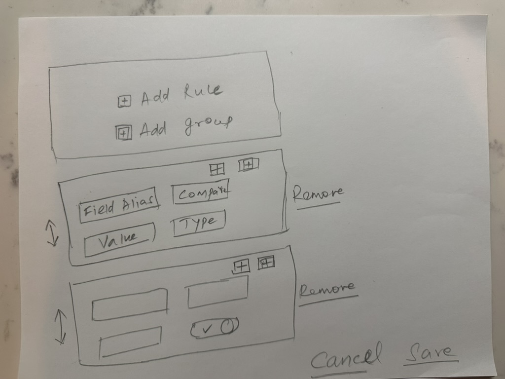
- Structure: information architecture, task flows, and responsive wireframes built around real tasks, such as “find all students eligible for X aid but missing Y documents.”
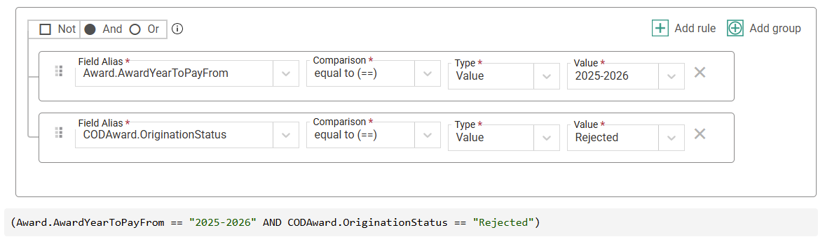
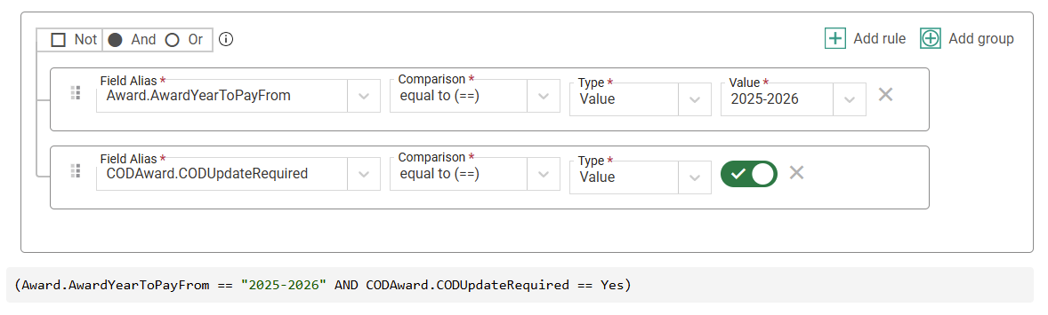
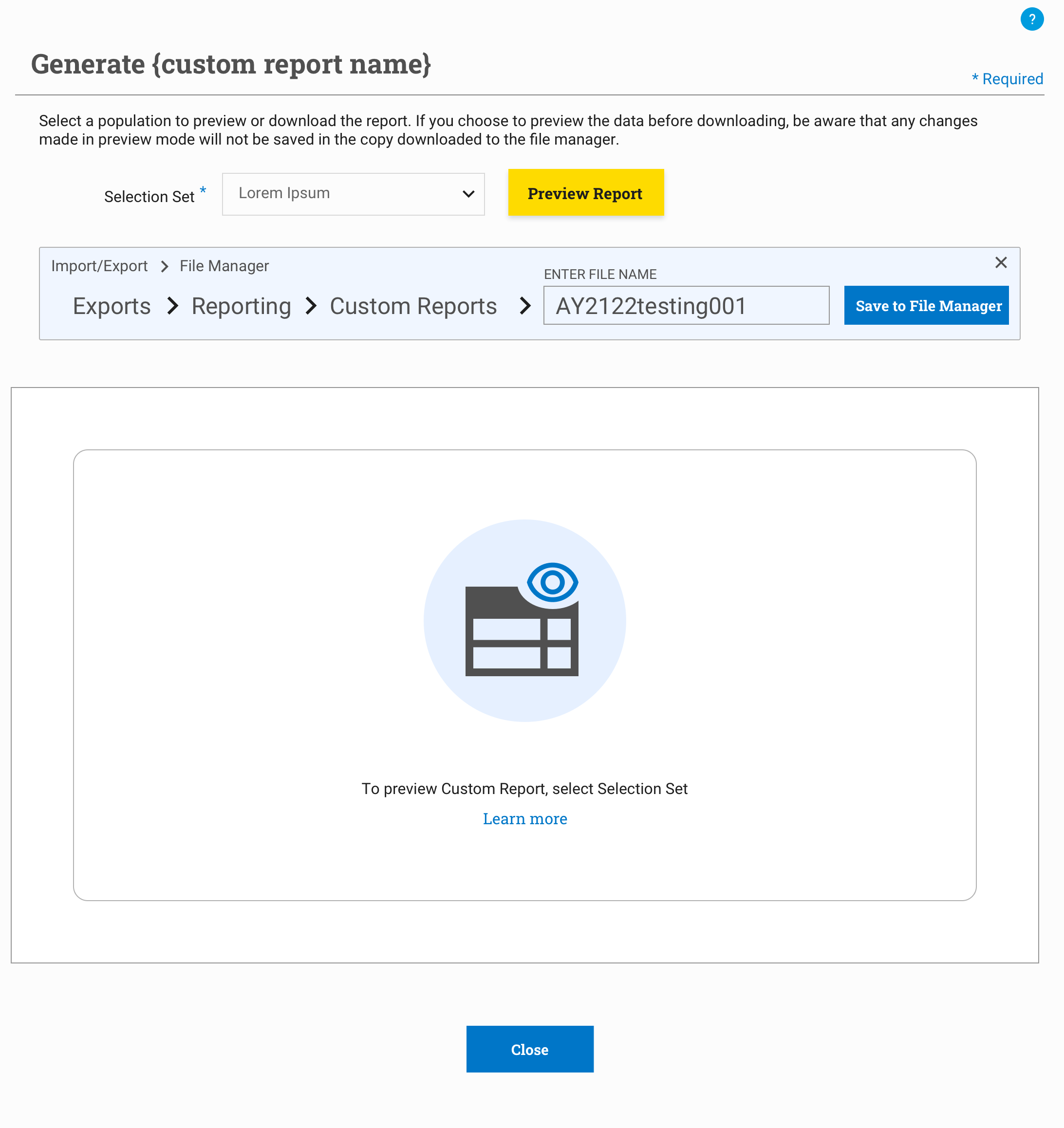
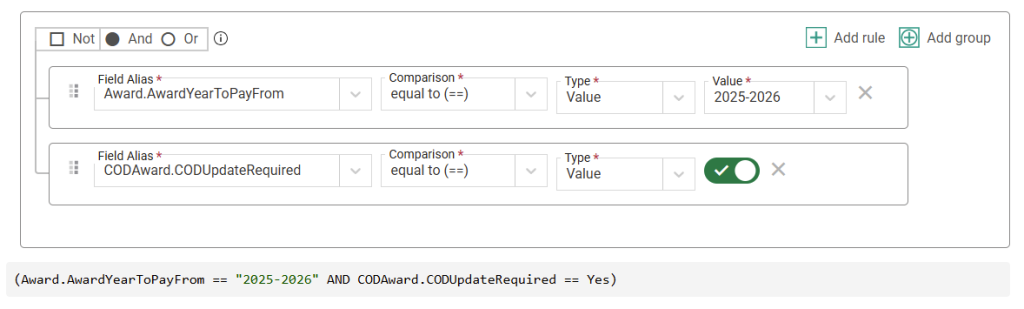
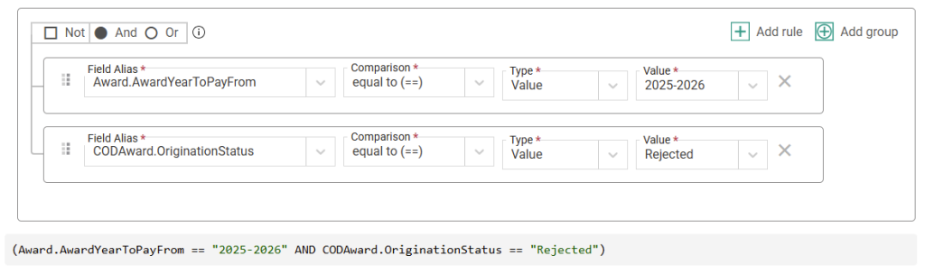
- Design: high-fidelity prototypes using Apricot Design System components, visual filter building (chips, grouped conditions), and a real-time preview of matching results.
- Validate: iterative usability testing; plain-language relabeling (“Selection Set” → “Saved Search Criteria”); a multi-layered condition builder simplified into a wizard flow.
- Deliver: development-ready interaction specs for Agile delivery, with Section 508 and WCAG requirements built into design reviews and React implementation discussions.
Problem → Design Response
| What users struggled with | Design response | Documented result |
|---|---|---|
| Steep learning curve for building advanced searches | Wizard-style flow replacing a multi-layered condition builder | Saved-set setup time cut by 50% |
| Overly technical terminology | Plain-language relabeling (“Selection Set” → “Saved Search Criteria”) | Comprehension of search logic up 60% in usability testing |
| No visibility into saved searches or applied conditions | Visual rules and groups, a readable logic summary, and a real-time preview of matching results | Better discoverability and reuse of saved searches |
| One-off patterns across modules | Built from Apricot Design System components | Filter pattern reused in 3 other modules |
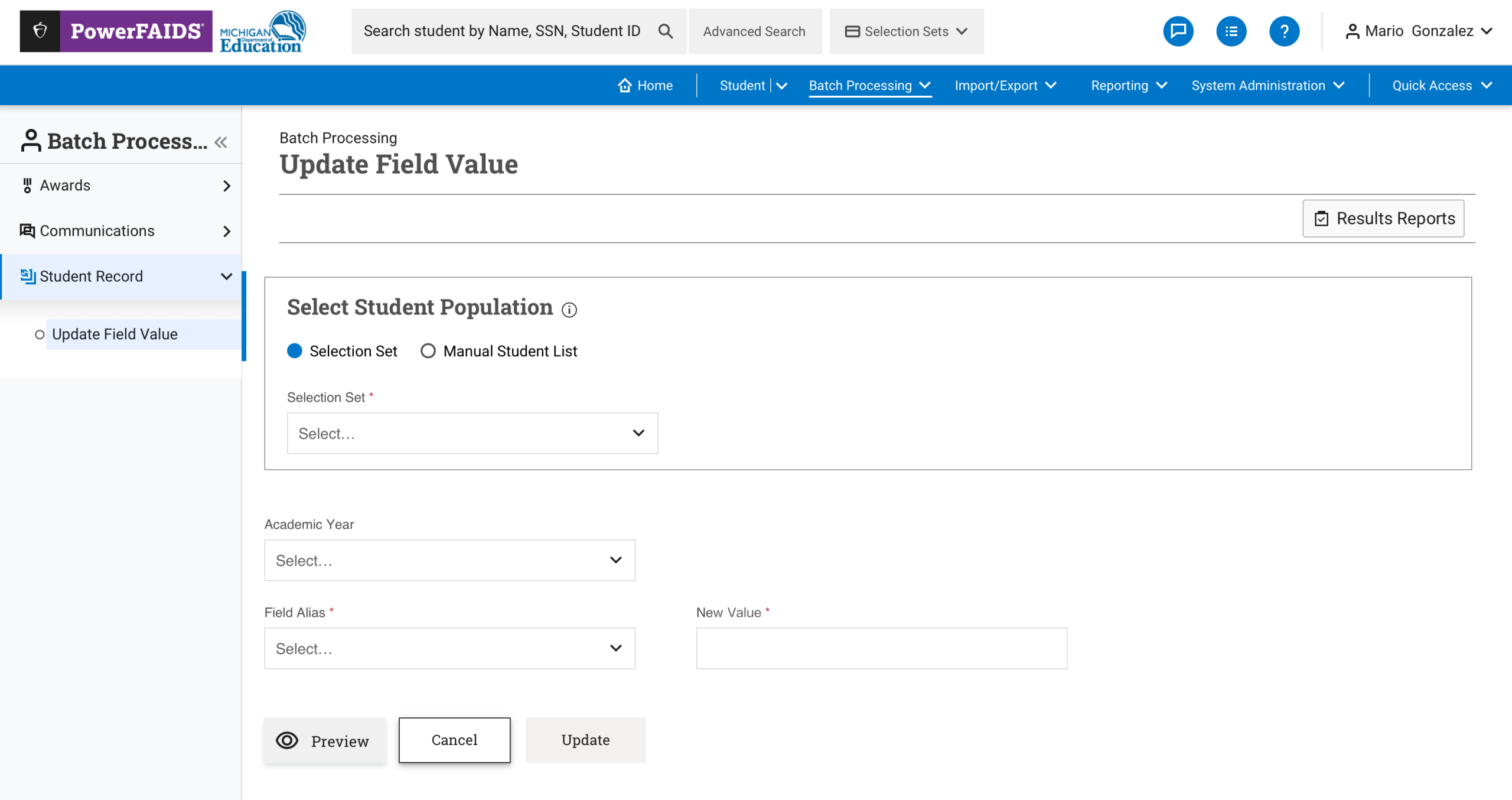
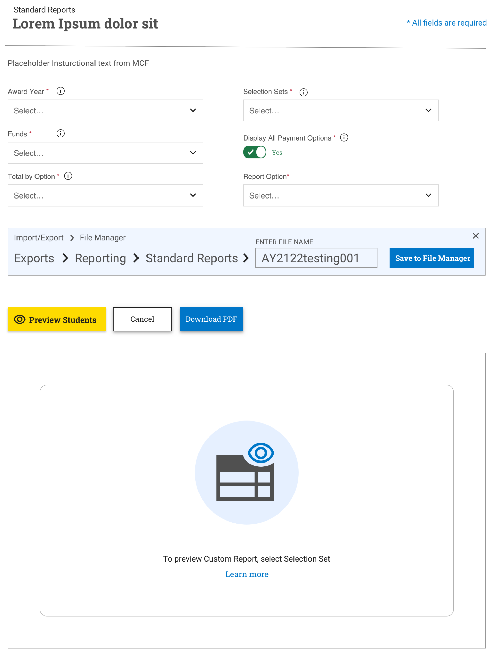
From Sketch to Shipped UI
Impact
- Task success up to 90% higher and onboarding time up to 70% lower on redesigned workflows
- Saved-search setup time cut by 50%; comprehension of search logic up 60% in usability testing
- The advanced filter pattern was reused in 3 other modules
- Ran recurring UX Clinics and design critiques; mentored junior designers and developers
Takeaway
Enterprise complexity doesn’t have to reach the user. Grounding the design in users’ own language, showing the system’s logic visually, and building accessibility in from the start made PowerFAIDS more powerful and more human.