Portfolio
Case Studies
CASE Study 1
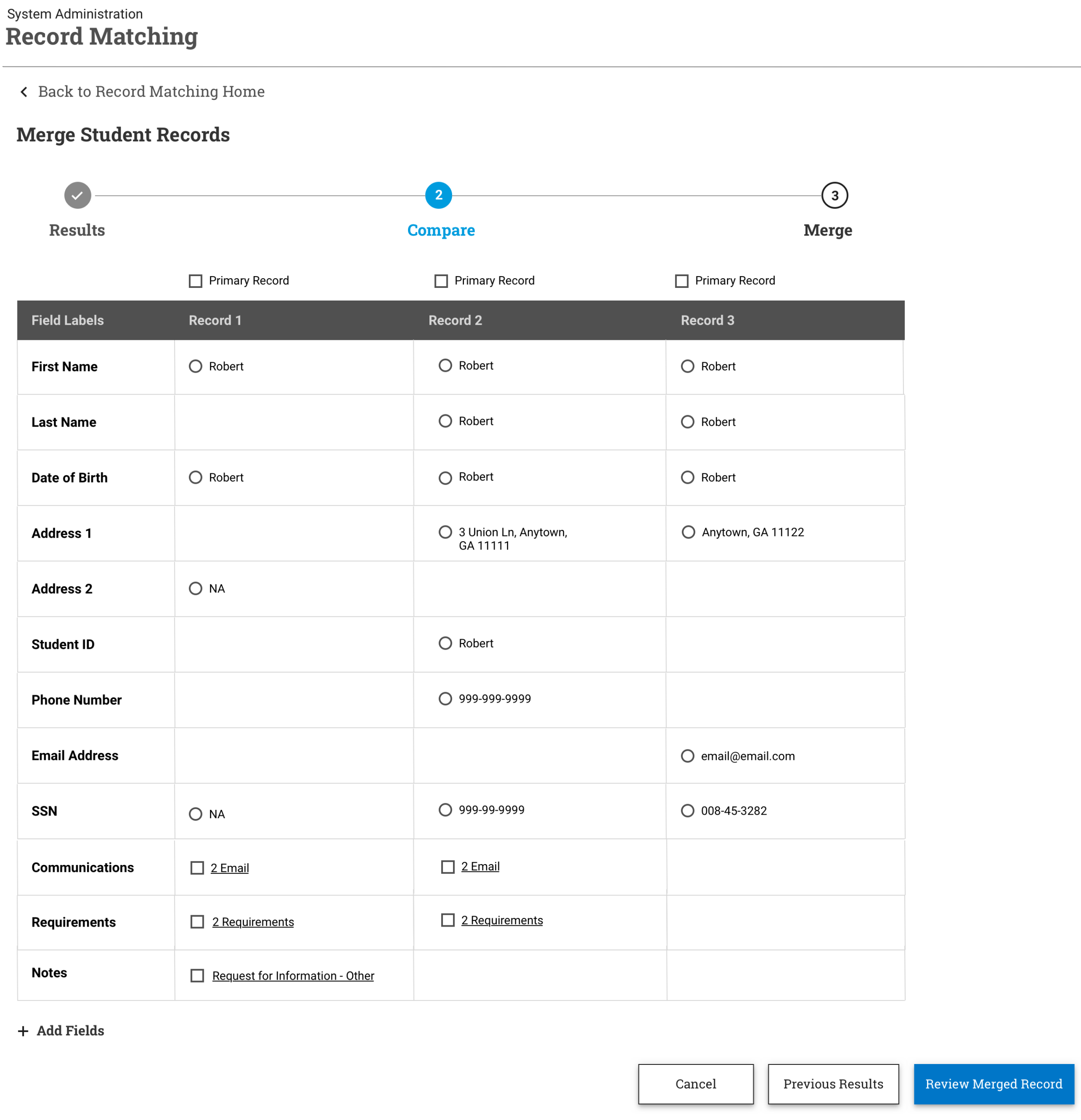
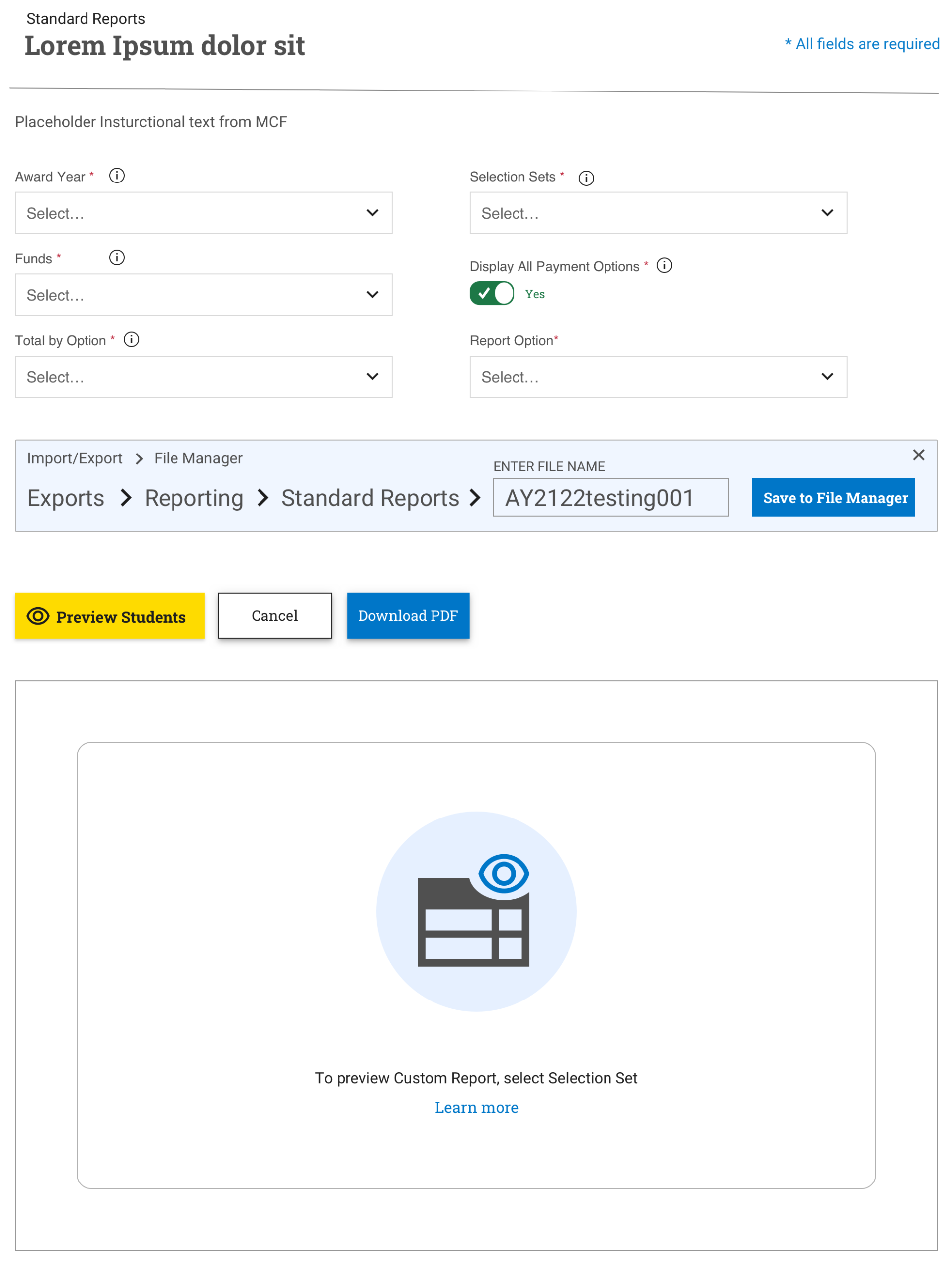
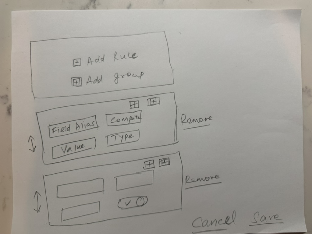
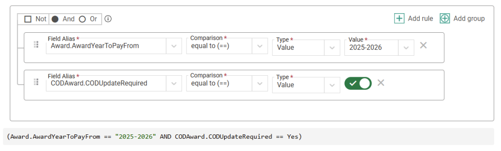
Simplifying Advanced Search with Selection Sets – College Board
Project Overview
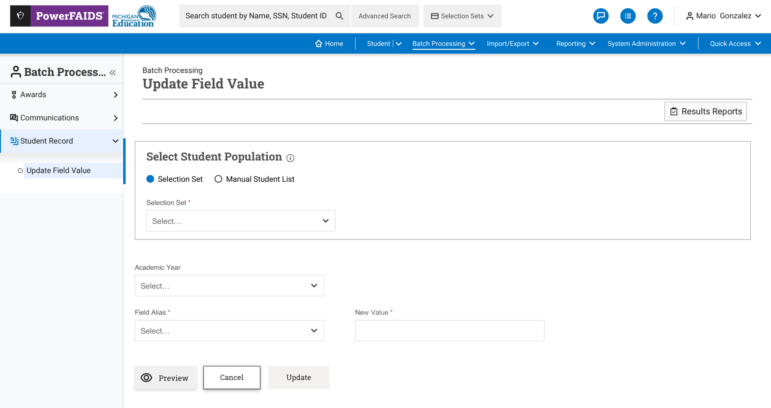
Project: Redesign of the “Selection Sets” Advanced Search Feature in PowerFAIDS
Role: Lead UX Designer
Tools: Figma, Apricot Design System, Protopie
Team: UX, Product Management, and Financial Aid SMEs
Duration: 4 months (Discovery through implementation)
Problem
PowerFAIDS users (primarily financial aid administrators) relied heavily on advanced search to group, analyze, and take action on subsets of student data. The existing “Selection Sets” tool:
- Had a steep learning curve
- Included overly technical terminology
- Lacked visibility into saved searches or conditions applied
Goal
Redesign “Selection Sets” to:
- Make building and managing advanced filters intuitive
- Reduce time to create and reuse saved sets
- Ensure alignment with accessibility and performance standards
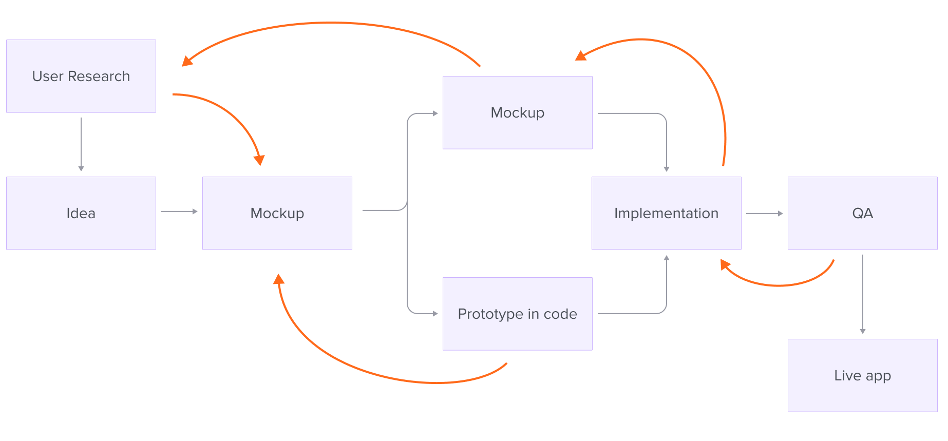
Process
1. Discovery
- Interviewed 10+ financial aid users across different institution types
- Mapped out current workflows and pain points related to search logic, conditions, and saved queries
2. Design Exploration
- Created task-based user flows for key use cases (e.g., “Find all students eligible for X aid but missing Y docs”)
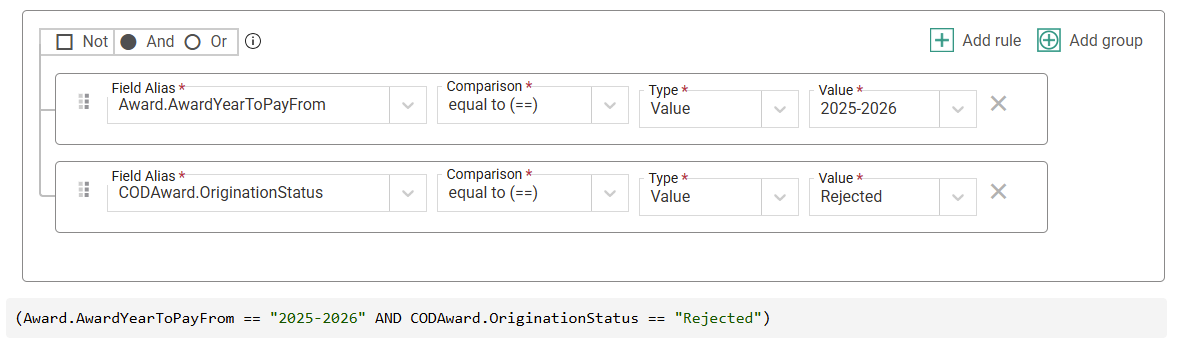
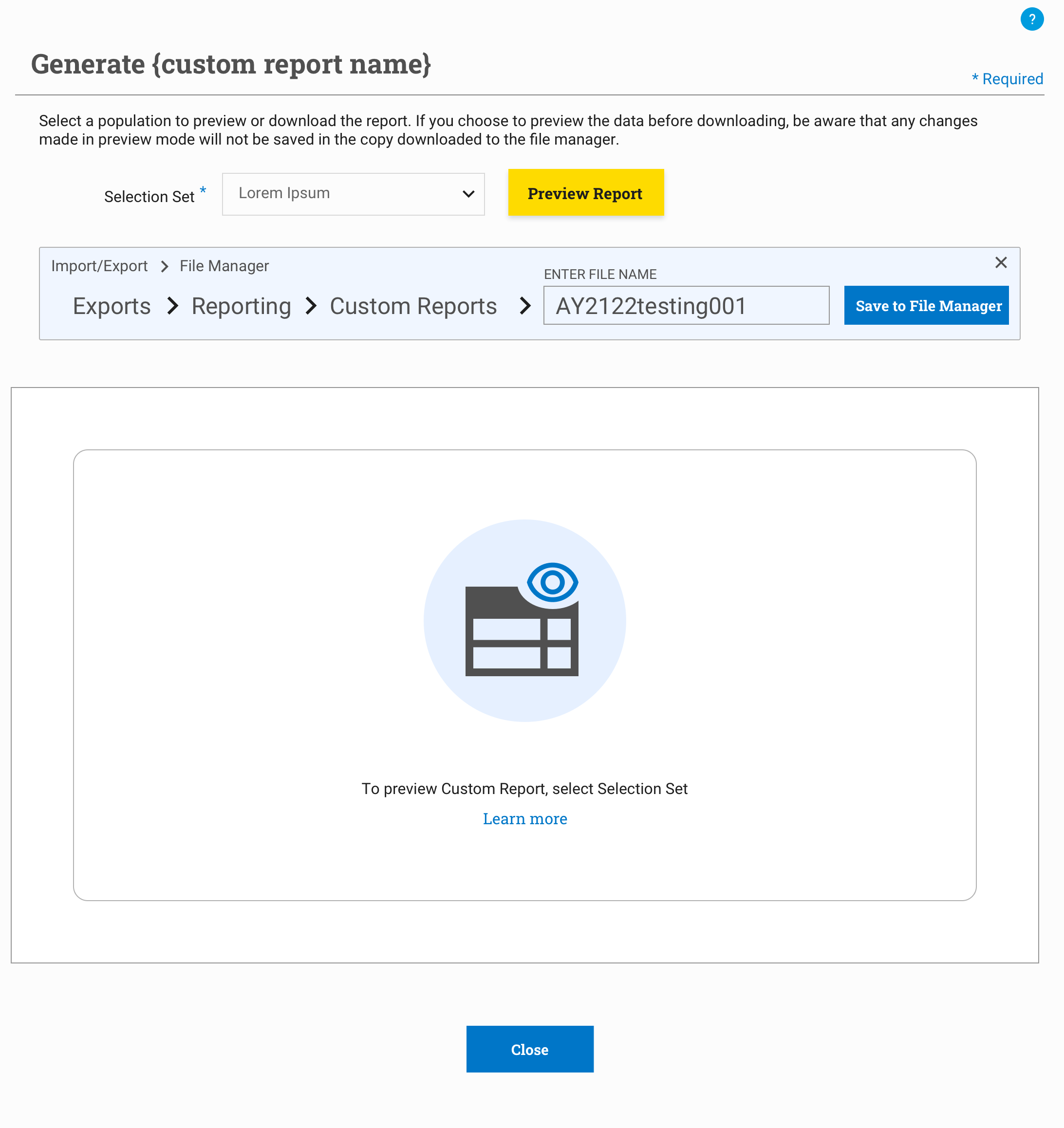
- Introduced visual filter-building patterns (chips, conditions, and grouped logic)
- Added a real-time preview of matching results
3. Testing & Iteration
- Conducted usability testing on low- and mid-fidelity prototypes
- Refined language (e.g., “Selection Set” → “Saved Search Criteria”)
- Simplified multi-layered condition builder into a wizard-style flow
4. Handoff & Integration
- Delivered annotated designs and edge cases via Figma
- Collaborated with dev team to ensure the UI used existing design system components


Impact
- Reduced setup time for new saved sets by 50%
- Increased discoverability and reuse of saved searches
- Improved comprehension of search logic by 60% in usability testing
- Created a reusable advanced filter pattern now adopted in 3 other modules
Takeaway
Advanced search UX doesn’t have to be intimidating. By grounding the interaction in user language and providing visual feedback and reuse options, we made PowerFAIDS more powerful—and more human.
CASE Study 2 – Agentic AI
Agentic AI-Powered Smart Financial Advisor
Purpose: Design a UX system for an intelligent agent that autonomously advises, plans, and takes action on personal finance matters (budgeting, saving, investing, fraud alerts, etc.), adaptable by any commercial bank.
Project Overview
Project Title: Smart Financial Advisor – Agentic AI for Global Banking
Role: Lead UX Designer
Team: Cross-functional team including UX designers, AI/ML engineers, financial domain experts, legal/compliance officers, and product managers
Duration: 6 months (from discovery to MVP prototype)
Tools: Figma, FigJam, ChatGPT (for prompt prototyping), Dovetail (user research) Google Forms (surveys), Notion (documentation)
Platform: Mobile and Web Banking Apps
Problem Statement
Most banking customers struggle with managing personal finances due to a lack of timely, personalized guidance and limited financial literacy. Traditional banking apps are reactive and require users to manually track spending, budgeting, saving, and investment decisions. As a result, users often miss financial opportunities, fail to detect risky behavior, or experience decision fatigue—especially across different regions with varying financial norms.
Goal
Design an agentic AI-powered smart financial advisor that proactively assists users in managing their finances by autonomously offering insights, making contextual recommendations, and taking approved actions. The system must be globally adaptable, secure, explainable, and allow users to control the level of autonomy—building trust while reducing financial decision burden within mobile and web banking platforms.
1. Define the Problem & Context
Goal: Understand the global user need and environment.
- Problem: Banking customers are overwhelmed with choices, have poor financial literacy, and want proactive, trusted help.
- Primary User Personas:
- Salaried middle-class individuals
- Small business owners
- Retired citizens
- Pain Points:
- Lack of timely financial advice
- Confusion in understanding bank offerings
- Missed opportunities for savings/investments
- Contextual Factors:
- Global applicability: language, regional regulations, banking integrations, currency formatting
- Agent must operate within a bank’s mobile app and web app, securely
2. User Research + Mental Model Mapping
Goal: Understand how users currently manage money and view automated advisors.
- Methodology:
- Interviews across 5 countries (USA, India, Brazil, UK, Nigeria)
- Surveys on trust in digital banking tools
- Diary studies: Track how people handle expenses, savings, investments
- Findings:
- Users prefer recommendations + manual confirmation over full autonomy (at first)
- They want clear explanations for suggestions
- Concerns about data privacy and overreach
- Mental Models Mapped:
- “Financial advisor as coach” vs “advisor as auto-pilot”
- Trust is built when users can see and correct the AI’s decisions
3. AI + UX Feasibility Alignment
Goal: Partner with engineers and policy teams to scope agent behavior.
- Capabilities the agent can autonomously handle:
- Detecting unusual transactions
- Budget forecasting based on spend
- Nudging users toward better credit utilization
- Initiating savings transfers based on patterns
- Agent Role Defined:
- Role: Smart Advisor, not Enforcer
- Tone: Empathetic, insightful, clear
- Autonomy Levels: Suggest, Act with Approval, Auto-Act (based on user profile)
- Tech Constraints:
- Secure data processing via bank APIs
- Embedded LLM with prompt templates localized per region
- Regulation sandboxing (e.g., EU GDPR, U.S. FCRA compliance)
4. Design Interaction Paradigms for Agentic Behavior
Goal: Enable transparent, controllable autonomous actions
- Core UX Patterns:
- “You might want to…” Cards: Personalized nudges with context (savings, spending habits)
- Financial Forecast Timeline: Visual projection of cash flow if agent suggestions are followed
- Explain-Then-Act buttons: Every recommendation comes with a “why”
- Autonomy Controls:
- Settings panel: Autonomy dial (e.g., low/medium/high)
- Consent prompts before first auto-action
- Undo/Review history feature (Agent’s Action Log)
5. Prototyping (Conversational + UI)
Goal: Validate design with users
- Tools Used: Figma for UI, ChatGPT for testing prompt logic, ProtoPie for micro-interaction demos
- Prototype Scenarios:
- Alert: “You’ve spent $300 more than usual this month – want to reduce next month’s shopping budget?”
- Action: “I noticed you get paid on the 1st. Would you like me to auto-transfer $200 to savings on payday?”
- Fraud Alert: “Unusual purchase at 3AM in Japan. Shall I freeze the card until confirmed?”
- Internationalization Demos: UI in Spanish, Hindi, Portuguese, English, Yoruba
6. Usability + AI Behavior Testing
Goal: Build trust and confirm usability across cultures
- Testing Methods:
- Remote usability testing in 6 countries
- A/B tests for agent tone (formal vs conversational)
- Trust score survey: “Do you trust the agent to make decisions on your behalf?”
- Results:
- Users preferred co-pilot mode to start, then graduated to more autonomy
- Demand for “undo” or rollback options was high
- Explanations increased adoption by 42%
7. Final Deliverables
Complete UX System for Bank Partners
Slack-integrated feedback loop during rollout
Design Artifacts:
User flows for savings nudges, credit monitoring, spend categorization
Globalized component library (fonts, formats, icons)
20+ Figma screens (mobile + desktop)
Microinteractions for consent, confirmations, and forecasts
Documentation:
Prompt architecture (sample prompts + fallback templates)
AI Agent Behavior Matrix (Suggest vs Act vs Alert use cases)
Content style guide for agent tone
Compliance checklist (regional variants)
Developer Handoff Package:
JSON structure for user data insights
API integration blueprint for savings, alerts, and investment suggestions
CASE Study 3 – GEN AI
Designing a Co-Pilot for Financial Aid Officers
Project Overview
Project: AI-Powered Co-Pilot Interface for PowerFAIDS
Role: Lead UX Designer
Tools: Figma, ChatGPT (integration testing), WCAG validation tools
Team: Cross-functional team with product managers, AI/ML engineers, and policy experts
Duration: 6 months (exploration through MVP)
Problem
Financial aid officers manage thousands of student cases governed by complex rules and documentation. Navigating this complexity through static tools resulted in:
- High onboarding time
- Inconsistent interpretation of policy
- User fatigue during peak processing seasons
Goal
Design a GenAI-powered assistant that supports officers by:
- Summarizing student financial aid data
- Recommending next best actions
- Generating plain-language policy explanations
- Reducing task-switching and decision friction
Process
1. Discovery & Research
- Interviewed 12 financial aid officers
- Identified key pain points: dispersed data, ambiguous federal rules, manual navigation
2. Prompt Engineering & UX Mapping
- Partnered with ML engineers to shape prompt structures
- Designed conversational UI and user feedback mechanisms
3. Prototyping & Testing
- Created interactive prototypes in Figma
- Tested with real users during live case reviews
- Key features included:
- Editable AI responses (“Rephrase this”)
- Confidence levels and reasoning
- Flag-and-feedback UI to refine model output
4. Design System Integration
- Created reusable components:
- AI response cards
- Prompt input controls
- “Why this?” explanation toggles
- Integrated into Apricot Design System
Impact
- Reduced task completion time by 40%
- 83% of officers rated AI suggestions as helpful
- Reduced PDF/document review load by 60%
- Enabled rapid model improvement via structured user feedback
Takeaway
Designing with GenAI means building trust, not just features. By prioritizing transparency, control, and explainability, we turned a black-box tool into a collaborative assistant.
CASE Study 4
UX Strategy for the World Bank’s Trust Fund Platform
Project Overview
Project: Redesign of the World Bank’s Trust Fund and Global Careers Platforms
Role: UX Architect / Senior UX Specialist
Tools: Axure, HTML/CSS, custom design system components, usability testing tools
Team: Internal design and dev team, global stakeholders, external vendors
Duration: Multi-phase engagement (2010–2019)
Problem
The World Bank’s Trust Fund platform, used globally by fund managers and partner organizations, was fragmented, difficult to navigate, and heavily dependent on manual workflows. Users reported:
- Difficulty locating and managing fund activity data
- Steep learning curve for new staff
- Poor mobile responsiveness
Goal
Reimagine the platform to:
- Streamline fund management workflows
- Improve usability for a diverse, global audience
- Ensure accessibility and responsive design
- Align with new organizational goals and transparency initiatives
Process
1. Discovery & Workshops
- Facilitated stakeholder workshops across regions
- Conducted contextual inquiries with fund managers and country officers
2. Information Architecture & Wireframes
- Overhauled content taxonomy and navigation structure
- Created low- to high-fidelity wireframes to simplify complex reporting screens
3. Usability Testing & Iteration
- Ran multiple usability sessions with international users
- Identified areas of cognitive overload, adjusted layouts and language for clarity
4. Visual Design & Prototyping
- Developed responsive, WCAG-compliant UI
- Integrated with World Bank’s internal branding guidelines
- Delivered modular UI components for long-term scalability
5. Cross-Team Collaboration
- Worked closely with developers to align on front-end frameworks and handoff
- Built a centralized design library with standardized HTML/CSS snippets and UI assets
Impact
- Reduced task time by 25% across key workflows
- Bounce rate on careers site dropped by 30%
- Platform scaled to support new business lines with minimal design debt
- Recognized with VPU Team Award (2018) for excellence in design-led project delivery
Takeaway
Designing for a global financial institution means balancing clarity, scale, and regulation. Through hands-on research, scalable systems, and thoughtful IA, we made the World Bank’s digital infrastructure more inclusive and mission-aligned.

Empowering financial aid professionals with streamlined tools that balance institutional compliance and student success. I led strategic UX for PowerFAIDS Cloud, creating accessible, scalable solutions for one of the most trusted platforms in higher education funding.
Designing at a global scale, I shaped data-heavy platforms to drive impact across public-sector finance, environmental resilience, and international development. My work focused on clarity, accessibility, and equity—turning complexity into confidence for decision-makers worldwide.

Bridging user needs with innovation, I’ve designed intuitive financial systems that make budgeting, compliance, and portfolio tracking seamless. Whether in enterprise apps or mobile-first tools, my approach ensures trust, transparency, and speed in every interaction.
Beyond the Case Studies
A curated showcase of supporting UX artifacts—from fintech design systems and user flows to implementation-ready strategies and scalable style guides. These pieces reveal the thinking, structure, and polish behind every user experience.
Smart Design for Smarter Finance
A collection of UX design solutions crafted for financial platforms—focused on clarity, trust, and seamless user journeys. These screens highlight design patterns for complex workflows such as onboarding, dashboards, transaction flows, and data visualization tailored for high-stakes environments.
More details

UX Design Strategies
Design begins with understanding. My approach weaves together user research, behavioral insights, and business priorities to craft purposeful digital journeys. Whether it’s mapping user flows, building scalable interaction patterns, or simplifying complex systems, each strategy is focused on creating clarity, reducing friction, and delivering measurable impact.
More details
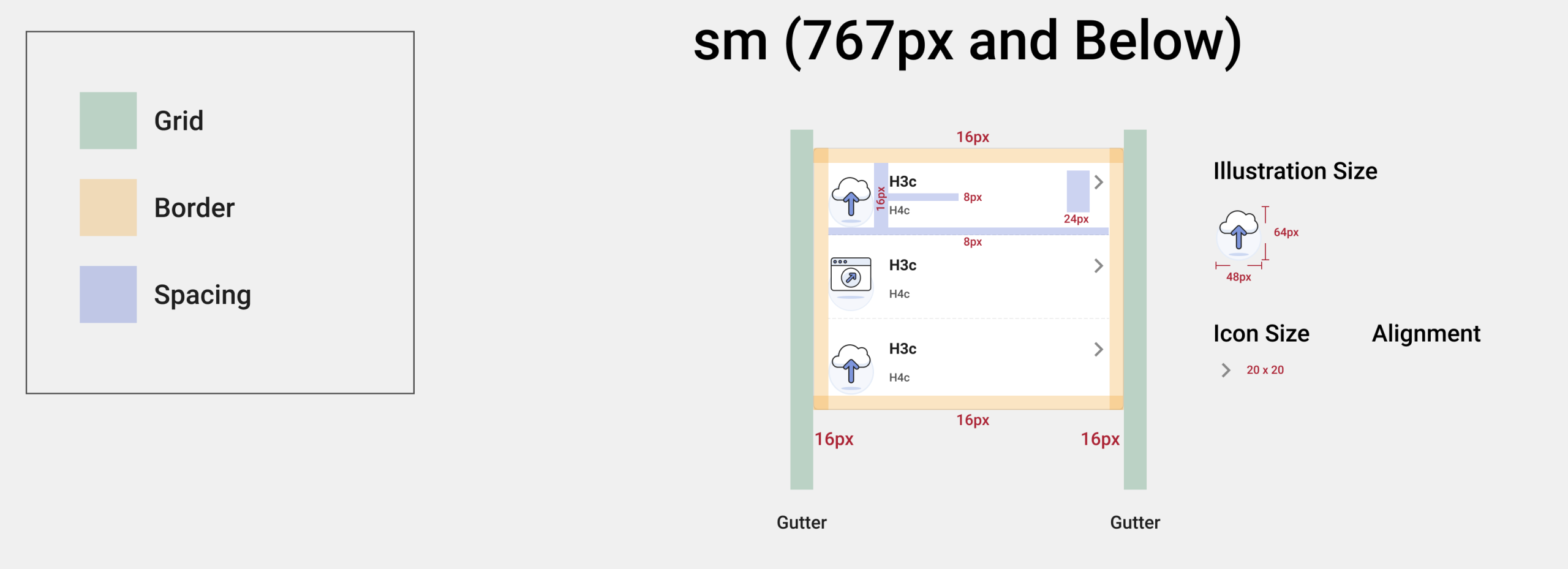
Styleguides
This style guide showcases the foundational elements that drive visual clarity and usability across the product ecosystem. From color systems and spacing to typography and UI anatomy, each artifact ensures design scalability and brand coherence across platforms.